TIDYING THE PADDOCK
A long play session turns up the small stuff: the things you stop seeing after the hundredth race but a new player spots on their first. This week we went round the race with a broom.
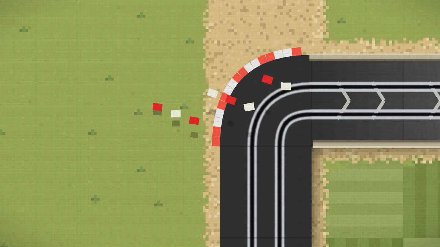
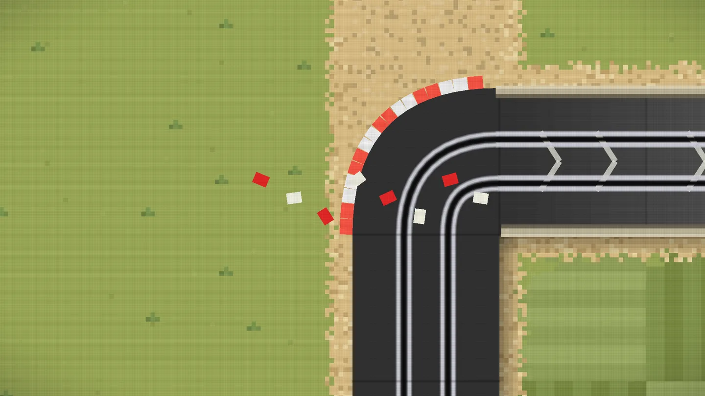
Start with the kerbstones. When a wreck knocks them out of a corner they still fly, but they had picked up a habit of carrying a dark round halo everywhere they went, even after landing, plus a thin dark outline the kerbs in the corner never had. They looked like stickers on the track rather than bits of it.
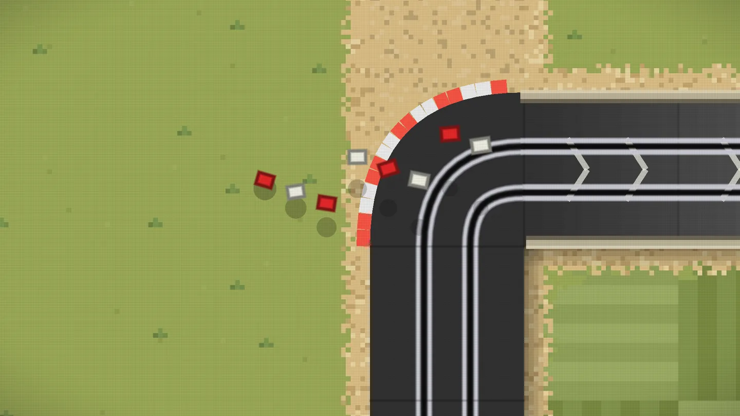
Now a stone is just a red or white block, like the ones still in the corner. It only casts a shadow while it's actually in the air: its own block shape on the ground, smaller and fainter the higher it goes, fading out as it comes back down.
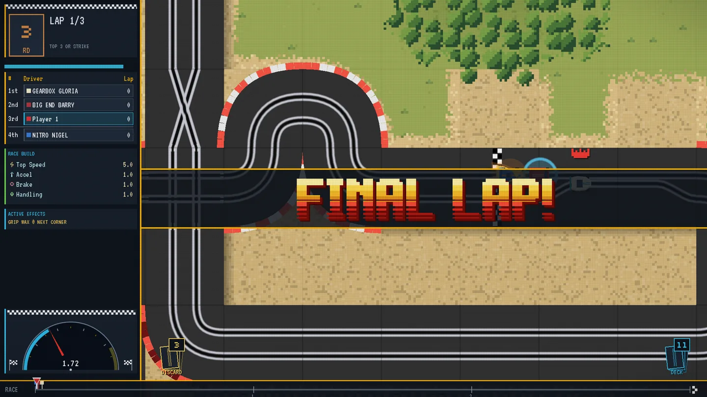
The big race callouts got the same treatment. The place you finish in already had its own chunky chrome lettering, but FINAL LAP, DUEL LOST and the rest still used an older font that sat next to it like a stranger. Everything in that strip now speaks one lettering: gold for the big moments, red for trouble, green for a lucky break. A rival's long grudge-match taunt shrinks and wraps onto two lines rather than running off the screen.
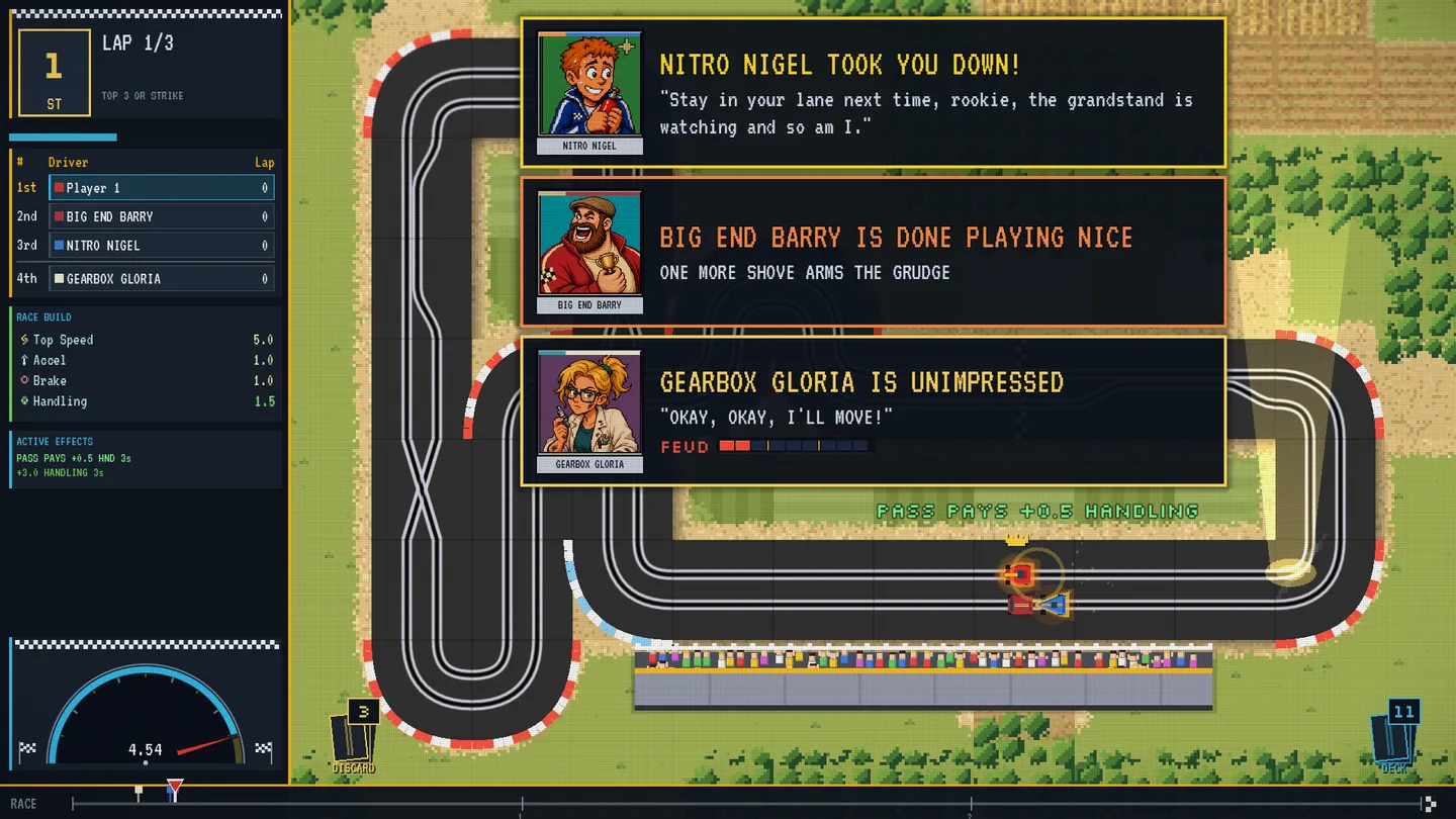
The racer pop-ups, where rivals gloat, sulk and swear revenge, now stack as cards of one width instead of a ragged pile of short and long boxes. A rival with a lot to say wraps onto a second line.
A few things you'll feel more than see: the sidebar slides away the moment you cross the line, so YOU FINISHED gets the whole screen. Clicking the next stop on the map opens it right where you're looking, with no sudden slide across the country. And picking your post-race reward card now pops it from its middle instead of jerking it toward its top corner.
These are captures from the native Windows desktop build. Nothing about how races, cards or the map play has changed. Kerbstones still fly, bounce and sink in rivers exactly as before; they just look like they belong.