A BETTER ANGLE
We love watching the tracks roll past before a run. The old menu sat to one side to give them room, but its staircase of boxes needed a clearer shape.
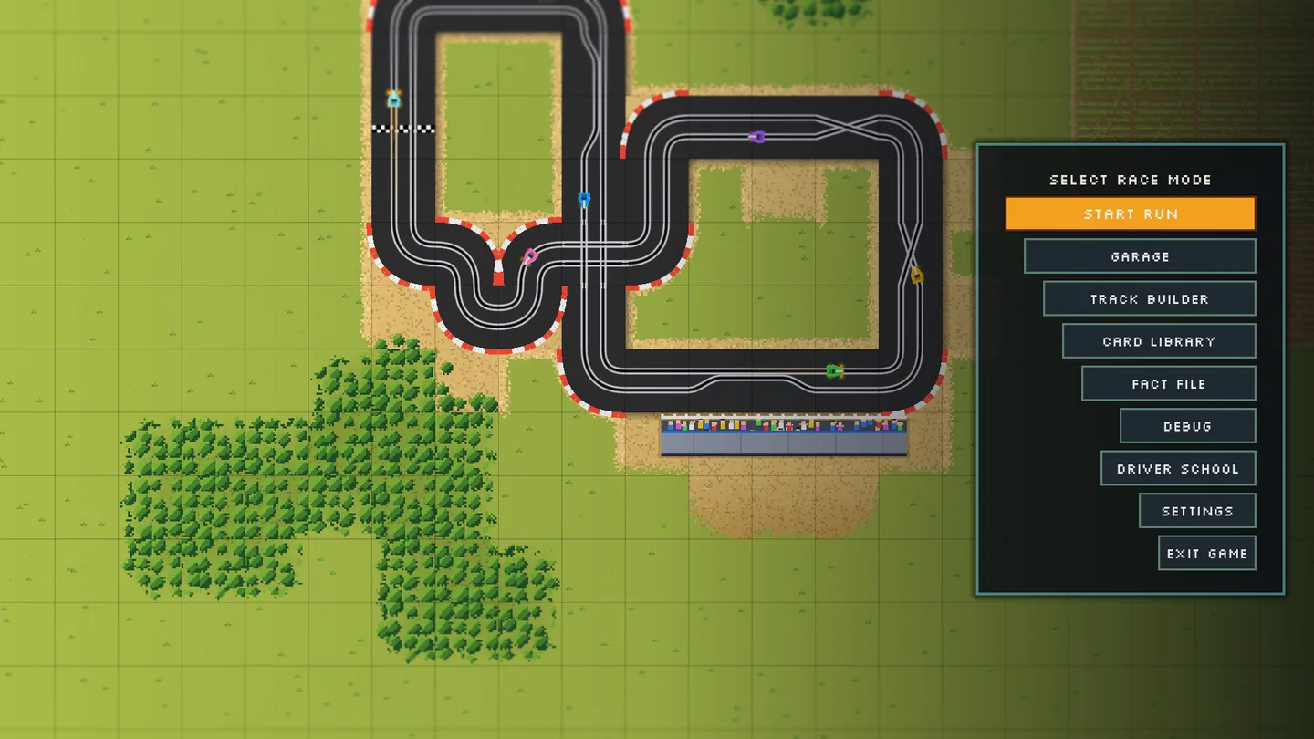
The new panel cuts across the right edge on a slant. We kept the game's charcoal, teal, amber and pixel lettering, brought the logo back, and made the selected row the only amber highlight. A moving pixel arrow follows your selection; Start Run goes plain when you move away. Settings and Exit sit together underneath. Every menu choice now gives the same short confirmation flash before opening, so the click lands before the next screen loads.
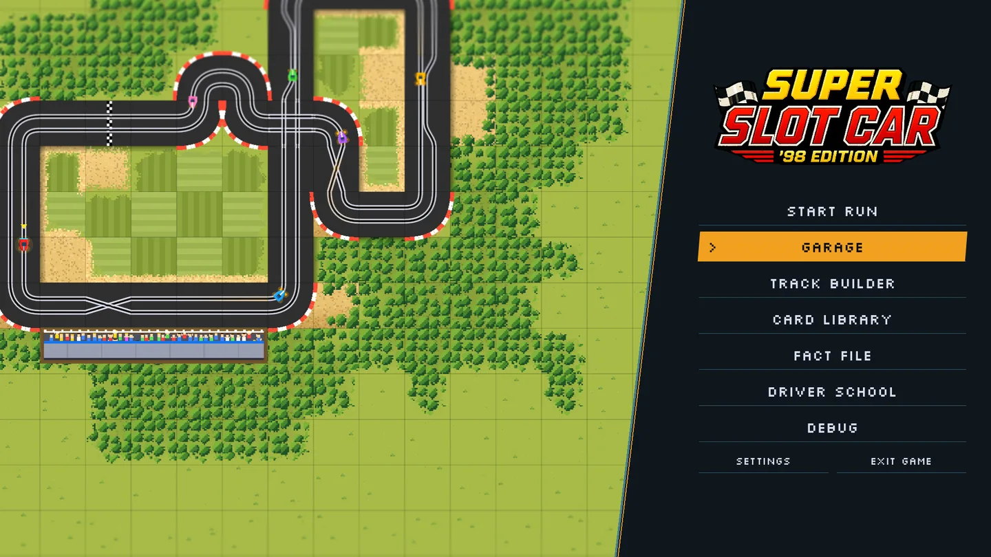
The flyovers now compose their shots inside the space beside the menu, including when the window size changes. The scenery also keeps its colour instead of fading into a dark overlay.
Keyboard and controller navigation still wrap through the choices, and a suspended run keeps both Continue Run and New Run within reach. This changes the front door; racing, cards and saved-run rules stay as they were.